OAuth & Sign in with Sporty
The Sign in with Sporty button
The official button, in three styles, and how to use it.
People trust a sign-in button they recognise. Use one of these instead of drawing your own.
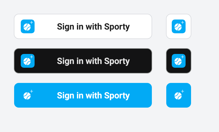
Download
| Style | Full button | Icon only |
|---|---|---|
| Light, for light backgrounds | light.svg | icon-light.svg |
| Dark, for dark backgrounds | dark.svg | icon-dark.svg |
| Blue, when it is the main way to sign in | blue.svg | icon-blue.svg |


The Sporty mark on its own is mark.svg, for building a button in your own component library.

Use it as HTML
Link the image to your application's own sign-in route, the one that starts the authorization code flow:
<a href="/auth/sporty" aria-label="Sign in with Sporty">
  <img src="https://docs.sporty.plus/brand/sign-in-with-sporty/light.svg"
       width="240" height="44" alt="Sign in with Sporty">
</a>
Host a copy of the SVG yourself if you prefer. The files will not change under you.
To build your own button, keep to the same parts: the mark on the left, the words Sign in
with Sporty, white #FFFFFF, dark #131314 or Sporty blue #02AAF5 as the background, and
corners rounded about as much as your other buttons.
Rules
- Say Sign in with Sporty or Continue with Sporty, or the same in your site's language. Do not shorten it to "Sporty" on a full-width button.
- Do not recolour, stretch or redraw the mark.
- Give it the same size and weight as the other sign-in buttons beside it. Do not make it smaller than 40 pixels tall.
- Keep space around it, about half its height.
- The button starts a sign-in and nothing else. Do not use it for a link to Sporty.